Page 1 of 5
Worst Non-Reject team liveries
Posted: 18 Apr 2009, 19:13
by Stormwind
This is half of two threads. I figured I might as well make two threads since fellow forum posters here are both articulate and detailed.
The premise of this thread is taking a non-reject team that had one ugly livery. I sense alot of people will vote for the 1999 British American Racing BAR 001.
But I do hope there's a little more imagination.
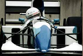
I'll add a more unusual choice for my entry. The 1993 Ferrari F93A
For as long as I can remember, The livery for Ferrari was uniformly red, With or without Marlboro sponsorship. In in 1993, a white line extending from the front of the cockpit to the rear of the engine cowling, and this effectively cut the red in two in such sharp contrast. It ruined the whole thing. This works on the Canadian flag maybe, But with the Ferrari F93A it's a strain on the eyes.
Re: Worst Non-Reject team liveries
Posted: 18 Apr 2009, 19:25
by rffp
The worst livery ever made in my humble opinion was the one Brabham had at the team's dying stages in 1992: the purple-pink paint job. It was simply dreadful!
The 1991 Lotus driven by Mika Hakkinen was also far from a good one.
Although I was a fan of Jordan, I think that yolk-yellow livery used in their last years reminded me of the Forti driven by the immortal Moreno!
Re: Worst Non-Reject team liveries
Posted: 18 Apr 2009, 19:52
by Faustus
The 2007 Honda. Looked good when the car was standing still, but was awful when in motion.
Re: Worst Non-Reject team liveries
Posted: 18 Apr 2009, 19:53
by midgrid
The Sauber C13 in the latter half of the 1994 season: black, covered in small white dots.
Re: Worst Non-Reject team liveries
Posted: 18 Apr 2009, 20:32
by Faustus
Jaguar R1
Completely the wrong shade of green, for a supposed British Racing Green. The large white surfaces with the HSBC logos really clashed with the green, as well.
Renault R202
Too much baby blue.
Re: Worst Non-Reject team liveries
Posted: 18 Apr 2009, 20:56
by Henrique
Renault R28
Re: Worst Non-Reject team liveries
Posted: 18 Apr 2009, 21:21
by RejectSteve
Every Ferrari from 1996-2007 with the orangish red colors. The cars with the Vodafone white on the sidepods had a little extra hideousness.
Honda RA108. The original earthdreams car wasn't that bad, performances aside. This one, with the two earth stripes along the nose was just stupid.
Larrousse LH94. All of you must be thinking I'm nuts, but remember the Kronenbourg cars at Aida and Imola?
The Winfield Williams of 1998 and 1999. Sir Frank's cars just don't look right in red.
The silver and red McLarens and their complete clash of colours there, far worse than the fag pack Marlboro colors.
Re: Worst Non-Reject team liveries
Posted: 18 Apr 2009, 22:51
by CarlosFerreira
Renault R29. Pig ugly with a hideous livery to boot.
Re: Worst Non-Reject team liveries
Posted: 19 Apr 2009, 00:21
by TomWazzleshaw
The late Lotus liveries (From 1990 onwards) were a bit more than eye destroying
The Brabham BT60B with the purple and pink livery... just does not work
Re: Worst Non-Reject team liveries
Posted: 19 Apr 2009, 05:41
by Captain Hammer
I can't believe nobody has mentioned the 1999 BAR "Zipper" livery: Lucky Strike on one side, 555 on the other, and what looked like a giant plastic zipper paintd yellow dividing the two of them. I have no idea how Villeneuve and Zonta managed to sleep at night while advertising two brands of cancer sticks.
The 2007/2008 Renault "baby-puke" livery was terrible because it used for major colours when three is generally the point where you've reached total saturation and anyting more clashes. True, the 2009 livery does the same thing, but as yelow, red and orange are all siilar, the effect is actually pretty good. The dark blue of the past two years is what made the cars so ghastly.
Ferrari from about 2000 to 2007. The Prancing Horses look good in Italian Racing Red and ONLY Italian Racing Re. The large bits of white really ruined it, kind of like when you're in the cinema and watchng a good film but your seat is really, really uncomfortable.
Re: Worst Non-Reject team liveries
Posted: 19 Apr 2009, 10:08
by CarlosFerreira
Captain Hammer wrote:I can't believe nobody has mentioned the 1999 BAR "Zipper" livery: Lucky Strike on one side, 555 on the other, and what looked like a giant plastic zipper paintd yellow dividing the two of them. I have no idea how Villeneuve and Zonta managed to sleep at night while advertising two brands of cancer sticks.
The 2007/2008 Renault "baby-puke" livery was terrible because it used for major colours when three is generally the point where you've reached total saturation and anyting more clashes. True, the 2009 livery does the same thing, but as yelow, red and orange are all siilar, the effect is actually pretty good. The dark blue of the past two years is what made the cars so ghastly.
Sure, the BAR was politically incorrect, to say the least; but I found the idea interesting, kinda liked the colours and it was different. As for this year's Renault...

Re: Worst Non-Reject team liveries
Posted: 19 Apr 2009, 11:33
by tristan1117
CarlosFerreira wrote:Captain Hammer wrote:I can't believe nobody has mentioned the 1999 BAR "Zipper" livery: Lucky Strike on one side, 555 on the other, and what looked like a giant plastic zipper paintd yellow dividing the two of them. I have no idea how Villeneuve and Zonta managed to sleep at night while advertising two brands of cancer sticks.
The 2007/2008 Renault "baby-puke" livery was terrible because it used for major colours when three is generally the point where you've reached total saturation and anyting more clashes. True, the 2009 livery does the same thing, but as yelow, red and orange are all siilar, the effect is actually pretty good. The dark blue of the past two years is what made the cars so ghastly.
Sure, the BAR was politically incorrect, to say the least; but I found the idea interesting, kinda liked the colours and it was different. As for this year's Renault...
Well what do you expect? BAR was a team run by a tobacco company. I agree the 07/08 Renaults looked terrible. They should have stuck with the baby blue. Now its just baby puke.
Re: Worst Non-Reject team liveries
Posted: 19 Apr 2009, 18:39
by Cynon
The past two Renault liveries have been hideous. Red, Orange, Yellow, and White do look nice together, but in order to have colors look nicely together, you have to have a design that won't look like puke!
1999 BAR looked pretty pug ugly from what I saw of it...
Last year's Honda was as ugly as it was slow. Thankfully very little as seen of it!
Re: Worst Non-Reject team liveries
Posted: 20 Apr 2009, 01:06
by rffp
The 1993 Scuderia Italia's Lola paint job was also weird, besides being the slowest car in the grid. It looked like a paint job for a "Monster Truck" show.
Most of Larrousse's paint jobs were made by someone on acid, but in their last year, 1994, they outdid theirselves and it was an ugly car - the colors simply didn't match.
I am trying to find a photograph of what I believe is the worst paint job I saw in an open wheel car, which was the F-3 driven by Tarso Marques in Brazil, sponsored by "Insetex", where there cockroaches painted all around the car!
Re: Worst Non-Reject team liveries
Posted: 20 Apr 2009, 01:58
by LionZoo
The Mastercard Lola. Was a clown car and painted to match.
Re: Worst Non-Reject team liveries
Posted: 20 Apr 2009, 06:26
by Faustus
I must admit that I quite liked the 1993 Scuderia Italia and the 1994 'Tourtel' Larrousse. The Larrousse was a beautifully designed car, but the Scuderia Italia Lola just looked like the F3000 car.
I didn't like pretty much all of the BARs. The white with the red Lucky Strike roundels looked pretty crap.
Re: Worst Non-Reject team liveries
Posted: 20 Apr 2009, 08:46
by noisebox
The 1996 B&H Jordan - started in gold as a mobile cigarette packet which looked bad enough, was then changed to a more TV friendly puke like yellow. Ghastly. They redeemed themselves by going for the snake/hornet noses in subsequent years.
The 96 car was notable for being the one Martin Brundle destroyed so impressively in Melbourne...
Re: Worst Non-Reject team liveries
Posted: 20 Apr 2009, 10:00
by runningboots
Stormwind wrote:I'll add a more unusual choice for my entry. The 1993 Ferrari F93A
For as long as I can remember, The livery for Ferrari was uniformly red, With or without Marlboro sponsorship. In in 1993, a white line extending from the front of the cockpit to the rear of the engine cowling, and this effectively cut the red in two in such sharp contrast. It ruined the whole thing. This works on the Canadian flag maybe, But with the Ferrari F93A it's a strain on the eyes.
The white stripe was a throwback to the same design on the mid-70s Ferraris, part of Luca Di M's actions on his return to Maranello. The stripes sometimes had the italian national colours in too.
For my part, Lotus "liveries" were horrible in the 90s before they died and linked up with Pacific.
Re: Worst Non-Reject team liveries
Posted: 20 Apr 2009, 11:11
by Faustus
CarlosFerreira wrote:Captain Hammer wrote:I can't believe nobody has mentioned the 1999 BAR "Zipper" livery: Lucky Strike on one side, 555 on the other, and what looked like a giant plastic zipper paintd yellow dividing the two of them. I have no idea how Villeneuve and Zonta managed to sleep at night while advertising two brands of cancer sticks.
The 2007/2008 Renault "baby-puke" livery was terrible because it used for major colours when three is generally the point where you've reached total saturation and anyting more clashes. True, the 2009 livery does the same thing, but as yelow, red and orange are all siilar, the effect is actually pretty good. The dark blue of the past two years is what made the cars so ghastly.
Sure, the BAR was politically incorrect, to say the least; but I found the idea interesting, kinda liked the colours and it was different. As for this year's Renault...
I agree, it was definitely an interesting idea and it certainly made for some interesting photos.
It's scary to imagine the amount of spares BAR would have had to produce and take with them to every race, if they had been allowed to run different liveries.
Re: Worst Non-Reject team liveries
Posted: 20 Apr 2009, 11:56
by midgrid
Jan Lammers' lion livery on the 1979 Shadow DN9.
Re: Worst Non-Reject team liveries
Posted: 20 Apr 2009, 13:00
by Life w12
midgrid wrote:Jan Lammers' lion livery on the 1979 Shadow DN9.

Looks like something that you would find on the side of a 1983 Dodge Van, not an F1 car!
Re: Worst Non-Reject team liveries
Posted: 20 Apr 2009, 13:01
by CarlosFerreira
Life w12 wrote:midgrid wrote:Jan Lammers' lion livery on the 1979 Shadow DN9.
[img]http://pro.corbis.com/images/42-18514055.jpg?size=67&uid={2CCD4983-9D4D-46C7-84B6-A5D39ADC1A63}[/img]
Looks like something that you would find on the side of a 1983 Dodge Van, not an F1 car!
Wow. I was sick on my shoes when I saw the picture.
Re: Worst Non-Reject team liveries
Posted: 20 Apr 2009, 18:18
by LionZoo
I quite like it, it's different. It reminds me of the helmets of some hockey goaltenders.
Re: Worst Non-Reject team liveries
Posted: 20 Apr 2009, 22:30
by Henrique
That lion's a sponsor or just some decoration?
Re: Worst Non-Reject team liveries
Posted: 21 Apr 2009, 00:17
by LukeB
Who knows, but it's hurting my eyes. Make it stop!
Re: Worst Non-Reject team liveries
Posted: 21 Apr 2009, 02:04
by RejectSteve
Henrique wrote:That lion's a sponsor or just some decoration?
The sponsor was Samson, which obvious is where the lion comes from. I like it as its different. Better than the little tiny ING lion on the current Renault.
Re: Worst Non-Reject team liveries
Posted: 21 Apr 2009, 05:01
by minrdi
Seeing the Jan Lammers Shadow livery, I'm reminded of a F1 car in the 70s that was sponsored by Penthouse, and it caused a stir for having a near-naked lady painted across it - I can't remember who drove it

I must say that I liked the Kronenbourg livery occasionally used by Larrousse in 1994.
I have to nominate the BAR liveries from the 2000s for their complete lack of imagination - a white car with stickers, how dull...
The 1986 Benetton livery was quite the eyesore too, I remember Clive James making some wonderful remarks in the Season Review video I have, but can't recall the specifics off the top of my head...
Re: Worst Non-Reject team liveries
Posted: 21 Apr 2009, 05:08
by Faustus
minrdi wrote:Seeing the Jan Lammers Shadow livery, I'm reminded of a F1 car in the 70s that was sponsored by Penthouse, and it caused a stir for having a near-naked lady painted across it - I can't remember who drove it
That would be the 1977 Hesketh, driven by Rupert Keegan, currently can be seen in the Thoroughbred Grand Prix championship.
minrdi wrote:The 1986 Benetton livery was quite the eyesore too, I remember Clive James making some wonderful remarks in the Season Review video I have, but can't recall the specifics off the top of my head...
That was the one with the coloured stripes on the engine cover, right? I guess it kind of fitted with the 'United Colors of Benetton' thing. I quite liked the 1985 Benetton Toleman, with all the flags.
Re: Worst Non-Reject team liveries
Posted: 21 Apr 2009, 09:15
by Captain Hammer
I was never exactly taken with the Midland one, but it was better than the Spyker MF1; that silver-and-orange just didn't work out. Nor did the original Spyker livery, as it looked like a traffic cone. They probably painted it that way to make it easier to find the car when Albers took a trip in the direction of the scenery. That said, the orange-and-tungsten design they settled on was actually pretty good.
Re: Worst Non-Reject team liveries
Posted: 21 Apr 2009, 18:05
by Reverie Planetarian
Ohhhh, I know I'm gonna take flak for this but the current Brawn GP colors don't seat well with me. Some liveries can pull off white...these guys just can't. The cars look like their primary color is primer coat!
Re: Worst Non-Reject team liveries
Posted: 21 Apr 2009, 20:34
by Salamander
Reverie Planetarian wrote:Ohhhh, I know I'm gonna take flak for this but the current Brawn GP colors don't seat well with me. Some liveries can pull off white...these guys just can't. The cars look like their primary color is primer coat!
I actually agree with you here, though my problem is more with the car's shade of yellow. It's too bright for my liking.
Re: Worst Non-Reject team liveries
Posted: 22 Apr 2009, 02:18
by fvanalst
To those who suggest that the 1986 Benetton B186 paint scheme was an eyesore, I respectfully disagree:

This car had the best paint scheme ever in the history of F1.
Jamie and Enoch, thanks for the "good-day" to me one on of the podcasts from last summer!
Re: Worst Non-Reject team liveries
Posted: 22 Apr 2009, 03:44
by Captain Hammer
That's because they landed in Melbourne tabula rasa. Once they have a full contingent of sponsors - and they now have four: Henri-Lloyd Virgin, MIG Investments and Ray-Ban - we'll probably get a full livery. Branson hinted at some bigger announcements to take place within a month of the Melbourne race - possibly becoming Brawn's title sponsor - so hopefully we'll know before Bahrain.
Re: Worst Non-Reject team liveries
Posted: 22 Apr 2009, 03:58
by minrdi
While not necessarily the worst livery I've seen, I remember the Gitanes livery Ligier adopted for the last two races in 1993:

Certainly a unique way to show off the brand, but the white splotches made it look like a bird bird had made a deposit all over the decal...
Re: Worst Non-Reject team liveries
Posted: 22 Apr 2009, 04:39
by Reverie Planetarian
Either that or that's a Holstein closing in on you in your rearview mirror...
Re: Worst Non-Reject team liveries
Posted: 27 Apr 2009, 17:18
by PayasYouDNPQ
Count me in with votes for the 1999 Williams (98 wasn't too bad, it looked good but shouldn't have been on a Williams) and the late Lotus's. 94 Larrouse looked great in green but horrible in red/white.
I'd say Rosbergs McLaren from '86 with the Marlboro lights livery should go here too. It just looked like it had been left out in the sun for a year.
I actually quite like the 93 Ferrari.
Re: Worst Non-Reject team liveries
Posted: 29 Apr 2009, 08:52
by Goa
minrdi wrote:While not necessarily the worst livery I've seen, I remember the Gitanes livery Ligier adopted for the last two races in 1993
I loved that car. I really wish another team would do that for a race or two. Red Bull, maybe? They seem like they'd be more open to something like that than most other teams, and they don't have a bunch of sponsors that would be kicking and screaming as a result.
Re: Worst Non-Reject team liveries
Posted: 29 Apr 2009, 14:23
by midgrid
Goa wrote:minrdi wrote:While not necessarily the worst livery I've seen, I remember the Gitanes livery Ligier adopted for the last two races in 1993
I loved that car. I really wish another team would do that for a race or two. Red Bull, maybe? They seem like they'd be more open to something like that than most other teams, and they don't have a bunch of sponsors that would be kicking and screaming as a result.
Red Bull Racing have had four special liveries so far: Star Wars at Monaco 2005, Superman at Monaco 2006, Wings for Life at Silverstone 2007, and WfL again on Couthard's car only at Interlagos 2008, so they could easily do it again.
Re: Worst Non-Reject team liveries
Posted: 29 Apr 2009, 16:00
by DonTirri
Two liveries that deserve a mention, both from the team that is the true embodiment of Reject but isnt, Minardi.
The 2000 Fortiesque livery

And the 1994 Jordan meets Canada92March:

The first is just horrible, painful to look at and just weird. The second has the worst mixture of colors, too similar to the Jordan of same year and was simply too Crowded.
In comparison, Sasol Jordan from 94:

Re: Worst Non-Reject team liveries
Posted: 29 Apr 2009, 19:39
by WeirdKerr
DonTirri wrote:And the 1994 Jordan meets Canada92March:
thats actually the 1994 minardi
