Page 1 of 1
Livery vs. Chassis
Posted: 14 Jun 2015, 20:54
by Chrisdude
Hey all
I have read many threads in many forums about beautiful or ugly F1 cars, but I can't remember a thread discussing if or when a car might have been a real work of art, spoiled by a crap livery, or when there was an eye-burning livery spoiling an otherwise nice looking car. What do you think?
My reasoning for this came from seeing what is obviously a Jordan J191 test car painted in the 1992 colours, I guess to use for promotional purposes
Other examples, well I thought the 1994 Sauber with the Broker sponsor looked great until they did the Tissot livery, what do you think? Awesome looking cars ruined by hideous liveries, or awesome liveries wasted on awful looking cars.
Re: Livery vs. Chassis
Posted: 14 Jun 2015, 23:13
by DemocalypseNow
I can't think of an F1 example off the top of my head, but sportscars come to mind.
The Busby Porsche 962 comes to mind. Not only did it have a horrendous Miller livery with an ugly shade of gold, it had modifield aero that ruined some of the beautiful clean lines of the car with angular garbage.

Re: Livery vs. Chassis
Posted: 14 Jun 2015, 23:45
by FullMetalJack

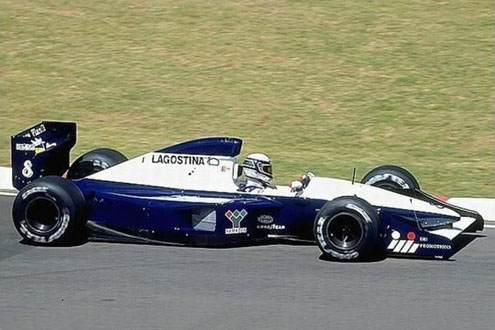
Brabham BT59Y used for the first two races of 1991. Very bad livery in my opinion, on a very good looking car.
The car was a real looker in it's 1990 livery.

Re: Livery vs. Chassis
Posted: 15 Jun 2015, 07:23
by Rabbi Gordon
Staying with Brabham, there is the BT60B too:
Early season -
Mid season -

Late season -

There also is the Osella FA1M-E:

Could have looked so nice, but no.
Matra MS120 (1970)

 - Hey, Jean-Pierre, I finished painting our car and it looks stunning!
- I see Yves, something has to be done... Put on all the stickers you can find in the garage.
- Did it, but it still looks reasonably nice.
- I know! Here is a bit of my bedsheet and a pack of crayolas, ask Henri to write his name on the sheet and slap it on the sidepod!
- We did it, Jean-Pierre! It's ugly now.
Re: Livery vs. Chassis
Posted: 15 Jun 2015, 11:16
by AdrianBelmonte_
Rabbi Gordon wrote:Late season -
I see what you did there...
Re: Livery vs. Chassis
Posted: 15 Jun 2015, 13:00
by dinizintheoven
FullMetalJack wrote:Brabham BT59Y used for the first two races of 1991. Very bad livery in my opinion, on a very good looking car.
Which may possibly have inspired another formerly successful team in 1993...

...as they lurched from one painfully terrible result to another for an
annus horribilis that only Prost in 2000 could rival.
Re: Livery vs. Chassis
Posted: 15 Jun 2015, 21:14
by James1978
I don't know if this counts but I thought a lot of the cars in 1994 looked lovely in the early part of the season but got ruined when they got all hacked about with the rule changes that came in following Imola. The main example I can think of was the Ferrari - the holes in the side of the airbox weren't too bad but they had to change it to down the spine for Hockenheim and it looked awful after that!
Re: Livery vs. Chassis
Posted: 16 Jun 2015, 03:02
by Klon
FullMetalJack wrote:Brabham BT59Y used for the first two races of 1991. Very bad livery in my opinion, on a very good looking car.
At the risk of appearing contrarian for the sake of it, I think it is the other way around. Decent livery on a hella ugly carshape. I mean, that airbox alone makes my eyes bleed.
Re: Livery vs. Chassis
Posted: 16 Jun 2015, 03:13
by Bobby Doorknobs
Klon wrote:FullMetalJack wrote:Brabham BT59Y used for the first two races of 1991. Very bad livery in my opinion, on a very good looking car.
At the risk of appearing contrarian for the sake of it, I think it is the other way around. Decent livery on a hella ugly carshape. I mean, that airbox alone makes my eyes bleed.
I agree with this, though the livery isn't great by Brabham's high standards, it's still ok, not amazing, but ok. And yeah, it's certainly not the best looking car of its time, better than the current generation of cars, but again, not amazing.
Re: Livery vs. Chassis
Posted: 16 Jun 2015, 22:09
by dinizintheoven
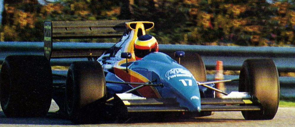
One car that I always rather liked was the AGS JH25. I have no idea why... it has the same kind of weird flat-topped airbox as the Brabham above, only this time it looks like even more of an afterthought, as if the garagistes in Gonfaron built the car with a bare roll bar and then realised what they'd done a bit too late (either that or they thought that the first car they built
with an airbox was so utterly terrible it was better without?) And the all-new all-black livery for the 1990 JH24 was hideously compromised by that whacking great question mark on the engine cover...
On the JH25, though, the black managed to disguise the worst feature on top of the car somewhat, and also helped to hide some of the more bulbous bits around the engine cover. It was already a very pointy car - and the silver stripes that were added only made it look even more pointy, like half of a flying V. And the pointier a guitar is, the better it is (providing you're playing pointy guitar music with it, which The Verve certainly isn't).

Look at it! If B.C. Rich built a Formula 1 car, that's what it would look like. And it even has the right number - the pointiness of the 17 works with the nose shape, and they even got the font right (Zapf Humanist, later used by Benetton from 1994-2001). Gabriele Tarquini is proud to drive it... Yannick Dalmas, less so, though he consoles himself with the thought that he had the pointier number the year before (to little effect). Admittedly, this car was still slow (if marginally faster than the JH24) and racked up far too many DNQs, but at least it looked good while it was farting to a standstill after three laps in practice...
...but then came 1991, and someone in France decided the JH25B should be repainted to look like the covers I had on my bed at the time. And that didn't go so well...

...and I can only imagine what is going through Stefan Johansson's head there, other than that he might already be plotting his move to the equally dismal pastures of Footwork-Porsche. He's probably grumbling about having to drive the car without the pointy number 17 on it, and when he inevitably fails to qualify he'll have to look at the car from the outside and see the horrible paint job and the strange airbox. But at least he jumped ship before
this happened...
I've been sick! And Gabriele Tarquini was sick as well, so he upped sticks and left for Fondmetal... leaving Olivier Grouillard to
not drive this car; apparently this is some bloke called Gustavo Pasetto, who I can only assume was colour blind. (See
here, though the author hasn't got a clue which model is which.)
What was wrong with the black, anyway? Surely that wasn't Ted Lapidus' trademark...
Re: Livery vs. Chassis
Posted: 17 Jun 2015, 18:29
by Barbazza
I weep at the sight of the shitbox that nearly destroyed my career!
At least you spared everyone pictures of me actually driving it.
Re: Livery vs. Chassis
Posted: 17 Jun 2015, 18:46
by Spectoremg
FullMetalJack wrote:Brabham BT59Y used for the first two races of 1991. Very bad livery in my opinion, on a very good looking car.
The car was a real looker in it's 1990 livery.
Blimey, I don't even remember that first livery. 'Most Forgettable Livery' thread anyone?

Re: Livery vs. Chassis
Posted: 17 Jun 2015, 21:34
by DemocalypseNow


What a difference a splash of colour makes! (Honda RA106 vs Super Aguri SA07)
Re: Livery vs. Chassis
Posted: 18 Jun 2015, 01:20
by Rabbi Gordon
Spectoremg wrote: 'Most Forgettable Livery'
How 'bout this?

It also is a crappy livery on an otherwise decent car.
Re: Livery vs. Chassis
Posted: 18 Jun 2015, 04:17
by FantometteBR
Some of those aren't that bad, with a few details... could be good... but, well, moving on...
Re: Livery vs. Chassis
Posted: 18 Jun 2015, 05:27
by tBone
The other way around also happened: a decent livery ruined by an ugly chassis. The Ligier Gitanes livery was quite good, but that JS5... No colour scheme would have made that thing look even average.

Also, the Tyrrell 025 would have looked a lot better in black.


Re: Livery vs. Chassis
Posted: 18 Jun 2015, 11:16
by Chrisdude
Ah yes, i was thinking of that 1997 Tyrrell too, interesting looking car, but shockingly poor livery, also remember it having a Xena Warrior Princess logo on it at some point, just to make matters worse. How about this pair:


Pretty lovely looking cars, but wtf Williams, why so ugly dressed in red!
Re: Livery vs. Chassis
Posted: 18 Jun 2015, 12:35
by DemocalypseNow
Chrisdude wrote:Pretty lovely looking cars, but wtf Williams, why so ugly dressed in red!
Definitely disagree for the 1998 car. Most are automatically put off just because it's a Williams, and thus anything other than a predominately white with blue/green/yellow as secondary colour is considered sacrilege. But the 1998 livery looked great - if it had been the livery of any other team we'd be talking about how great it looked.
Re: Livery vs. Chassis
Posted: 18 Jun 2015, 13:16
by Bobby Doorknobs
Biscione wrote:Chrisdude wrote:Pretty lovely looking cars, but wtf Williams, why so ugly dressed in red!
Definitely disagree for the 1998 car. Most are automatically put off just because it's a Williams, and thus anything other than a predominately white with blue/green/yellow as secondary colour is considered sacrilege. But the 1998 livery looked great - if it had been the livery of any other team we'd be talking about how great it looked.
Yeah, I also liked the 1998 livery, not so much the 1999 version. Although I still get confused whenever I watch an old race from 1998 and wonder why Jacques Villeneuve is driving a Ferrari

I never had this problem with Scuderia Italia though

Re: Livery vs. Chassis
Posted: 18 Jun 2015, 13:37
by tBone
I actually prefer the red Williams liveries to their white/blue liveries from the early 2000's. Those always seemed a bit bland to me.
Or does this belong in the unpopular opinion thread?
Re: Livery vs. Chassis
Posted: 18 Jun 2015, 14:45
by Chrisdude
I take your point on the '98 car, the more images I looked at the more I found it appealing from certain angles, but then I also always thought the Rothmans livery looked either gorgeous or average depending on the angle of the shot. Yeah it gets a bash in because the red is 'not very Williams' but I more disliked it because it looked to me like the sponsor logos were slapped on at random, but I still hate the 1999 one, when they introduced some yellow and blue flashes.
How about this one, classic Ferrari with the black wings, proper Marlboro (not the subliminal current branding) and the blue Fiat logo, plus the gold wheels but it went especially boobs up when they introduced the high nose:

But then again, I am strangely drawn to this, from the angle shown, even despite the really chunky iteration of the high cockpit sides rule:

Or how about this one, which livery do you prefer? Same season, different livery:
Shite, looks lumpy in all the wrong places

Looks smooth and sophisticated

Re: Livery vs. Chassis
Posted: 18 Jun 2015, 15:01
by Wallio
Simtek's '94 car looked gorgeous in testing, then it went purple and MTV.....
Two cars that had nice liveries but awful chassis:
Coloni-Subi looked the part in its Fuji colors, but all the extra air vents destroyed it
And the 2000 Jordan with the super high triangle airbox......ewwww
Re: Livery vs. Chassis
Posted: 18 Jun 2015, 17:17
by Chrisdude
I loved the purple Simtek, actually along with most cars from that era. I even like the pink livery of the 1992 Brabham, the thing I hate about that car is the nose cone, so car shape was the killer for me. What about these badboys:
Helmet looks like Dalmas, so Estoril?

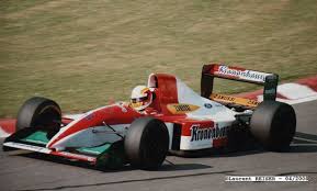
I liked the red and white one, reject-worthy for Beretta and extra reject worthy for the appearance of Comas on the scene of Tamburello '94
Re: Livery vs. Chassis
Posted: 18 Jun 2015, 23:34
by FullMetalJack
Not the greatest livery of all time, but I liked the BMW Williams combo.

The walrus nose however, nope.

Same goes for this Ferrari image I found when looking for an image of the FW26
Re: Livery vs. Chassis
Posted: 19 Jun 2015, 11:53
by DemocalypseNow
I must be the only person on earth who actually liked the walrus nose.
Re: Livery vs. Chassis
Posted: 19 Jun 2015, 11:54
by AndreaModa
Biscione wrote:I must be the only person on earth who actually liked the walrus nose.
No, I think it's pretty cool too! Not sure what's ugly about it really.
Re: Livery vs. Chassis
Posted: 19 Jun 2015, 12:03
by FullMetalJack
Chrisdude wrote:How about this one, classic Ferrari with the black wings, proper Marlboro (not the subliminal current branding) and the blue Fiat logo, plus the gold wheels but it went especially boobs up when they introduced the high nose:
But then again, I am strangely drawn to this, from the angle shown, even despite the really chunky iteration of the high cockpit sides rule:
The low nose version of that Ferrari is one of the most beautiful F1 cars of all time in my opinion. The high nose however, completely ruins it.
Here's a better view of the low nose.

Re: Livery vs. Chassis
Posted: 19 Jun 2015, 13:39
by Bobby Doorknobs
AndreaModa wrote:Biscione wrote:I must be the only person on earth who actually liked the walrus nose.
No, I think it's pretty cool too! Not sure what's ugly about it really.
Yeah, I too like the walrus nose. I tend to like most cars that have a weird design feature like the Williams FW26 or the Ligier JS5. It shows the designer was thinking outside the box.
Re: Livery vs. Chassis
Posted: 19 Jun 2015, 13:53
by DemocalypseNow
Simtek wrote:AndreaModa wrote:Biscione wrote:I must be the only person on earth who actually liked the walrus nose.
No, I think it's pretty cool too! Not sure what's ugly about it really.
Yeah, I too like the walrus nose. I tend to like most cars that have a weird design feature like the Williams FW26 or the Ligier JS5. It shows the designer was thinking outside the box.
Ouch. That's a backhanded compliment and a half.
I mean that it actually
looks good, not that it's weird or quirky or technically innovative and thus looks interesting! It definitely looked better than the ugly narrow nose of the FW27 the following season...
Re: Livery vs. Chassis
Posted: 19 Jun 2015, 16:03
by Bobby Doorknobs
Biscione wrote:Simtek wrote:Yeah, I too like the walrus nose. I tend to like most cars that have a weird design feature like the Williams FW26 or the Ligier JS5. It shows the designer was thinking outside the box.
Ouch. That's a backhanded compliment and a half.
I mean that it actually
looks good, not that it's weird or quirky or technically innovative and thus looks interesting! It definitely looked better than the ugly narrow nose of the FW27 the following season...
I do feel it looked better than most of its contemporaries. It's not a car that immediately springs to mind when I think of beautiful F1 cars but it certainly doesn't look ugly to me even when ignoring its quirkiness. And yes, it does look better than the FW27
Re: Livery vs. Chassis
Posted: 22 Nov 2022, 21:36
by Har1MAS1415
Williams FW36, great livery, least said the better about the nose cone.
Re: Livery vs. Chassis
Posted: 23 Nov 2022, 20:28
by Rob Dylan
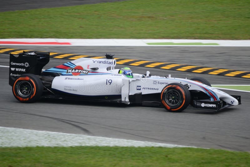
I do love those Martini Williams liveries. It's a crying shame that none ever won a race, because I think they may be the most beautiful cars of that era. Plus, with a rejuvenated Massa on pole for Austria, it at least saw some semblance of success from time to time

There's also something beautiful in just how sparse and spare the sponsors are. They're all in soft black font on a white background, meaning that the eye is really concentrating on that colourful line to the side. The black rear wing does the same thing. It makes the eye go exactly where the designers want it to go.
Re: Livery vs. Chassis
Posted: 24 Nov 2022, 20:37
by Har1MAS1415
Rob Dylan wrote: ↑23 Nov 2022, 20:28
I do love those Martini Williams liveries. It's a crying shame that none ever won a race, because I think they may be the most beautiful cars of that era. Plus, with a rejuvenated Massa on pole for Austria, it at least saw some semblance of success from time to time
There's also something beautiful in just how sparse and spare the sponsors are. They're all in soft black font on a white background, meaning that the eye is really concentrating on that colourful line to the side. The black rear wing does the same thing. It makes the eye go exactly where the designers want it to go.
It was just the first car I could think of.