Page 1 of 4
Reject Liveries
Posted: 25 Jan 2010, 09:53
by Captain Hammer
Inspired by a tangent in
this thread: a discusion for the worst liveries of all time. Like that
Xena: Warrior Prncess Tyrrell from 1997.
Discuss.
Re: Reject Liveries
Posted: 25 Jan 2010, 10:31
by noisebox
Two spring to mind - the awful BAR zipper, if your car is that crap then it's best not to draw attention to it by giving it the worst livery ever! The other one is the Brabham from 1992 as driven by a the most bizarre driver partnership I can remember - Giovanna Amati and Damon Hill!
Re: Reject Liveries
Posted: 25 Jan 2010, 10:37
by danardif1
noisebox wrote:Two spring to mind - the awful BAR zipper, if your car is that crap then it's best not to draw attention to it by giving it the worst livery ever! The other one is the Brabham from 1992 as driven by a the most bizarre driver partnership I can remember - Giovanna Amati and Damon Hill! Link to picture here:
http://www.f1technical.net/f1db/cars/im ... -BT60B.jpg
And Eric Van Der Poele!!!
Re: Reject Liveries
Posted: 25 Jan 2010, 11:34
by Gilles27
What about the Honda Earth Dreams thing? That was a mess!
Re: Reject Liveries
Posted: 25 Jan 2010, 11:38
by noisebox
Gilles27 wrote:What about the Honda Earth Dreams thing? That was a mess!
Brabham, BAR, Honda - looks like crap livery = crap car..
Re: Reject Liveries
Posted: 25 Jan 2010, 11:51
by ADx_Wales
To me, Brawn GP did not have a good livery, until Canon were on the sidepods, and then they were gone again, they seemed to have the 1992 march team sponsorship methods about them for brazil too.
Re: Reject Liveries
Posted: 25 Jan 2010, 12:27
by fjackdaw
I hated the red Williams of 1998/99, especially the Woody Woodpecker element.
Re: Reject Liveries
Posted: 25 Jan 2010, 13:05
by RaceFace
I know I am fussy, but Mrs. Amati did not drive the bubble-gum brabahm livery. She left the team as the cars where still in brab´s traditional white/blue colors...
Or am I totally wrong ?
Rgds
Dave
Re: Reject Liveries
Posted: 25 Jan 2010, 13:12
by Henrique
RaceFace wrote:I know I am fussy, but Mrs. Amati did not drive the bubble-gum brabahm livery. She left the team as the cars where still in brab´s traditional white/blue colors...
Or am I totally wrong ?
Rgds
Dave
http://f1rejects.com/drivers/amati/picture-index.html
Re: Reject Liveries
Posted: 25 Jan 2010, 13:46
by Tealy
Gilles27 wrote:What about the Honda Earth Dreams thing? That was a mess!
I actually quite liked the look the 07' Honda when the car was still. But when moving it looked a mess because there was far too much detail in the design.
I absolutely detest the 08' livery though.
Re: Reject Liveries
Posted: 25 Jan 2010, 13:56
by muttley
To be honest, I consider Brawn's livery to be rejectful. Never liked it.
But the absolute nadir of liveries has to be (what else?) Pacific 1994. Silver/gray with Fuchsia/Blue/Purple accents:

MY EYES!!!!

Re: Reject Liveries
Posted: 25 Jan 2010, 14:08
by Pieman
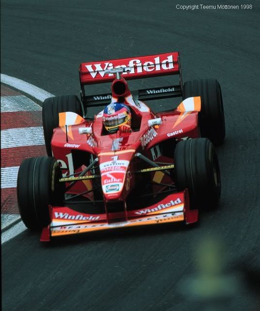
I actually didn't mind that Pacific, although it looked a bit amateurish. Their blue livery in 1995 was a 100% improvement.
I agree on the Winfield Williams though - Williams cars should always be blue and white and nothing else.
I always though the Larrousse-Lolas from 1990 looked a real mess, and I wasn't a fan of Team Lotus's last couple of paint schemes either - too many logos and colours mashed together.
Re: Reject Liveries
Posted: 25 Jan 2010, 14:46
by Bleu
RaceFace wrote:I know I am fussy, but Mrs. Amati did not drive the bubble-gum brabahm livery. She left the team as the cars where still in brab´s traditional white/blue colors...
Or am I totally wrong ?
Rgds
Dave
You are right. I checked van de Poele profile and there you can see that the livery changed between Canadian and French races.
Re: Reject Liveries
Posted: 25 Jan 2010, 15:50
by Phoenix
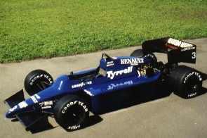
Brabham BT60, 1992
Tyrrell 014, 1985-1986
Minardi PS04, 2004 (sorry)

(AND SORRY AGAIN FOR THE DRIVER)
Re: Reject Liveries
Posted: 25 Jan 2010, 15:57
by noisebox
Here's another shocker being driven by a legend in our own lunchtimes:

Re: Reject Liveries
Posted: 25 Jan 2010, 16:02
by LucaPacchiarini
Phoenix wrote:Tyrrell 014, 1985-1986
What's wrong with it?
looks pretty normal to me.
Re: Reject Liveries
Posted: 25 Jan 2010, 16:16
by elho
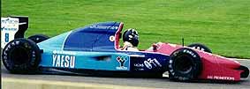
Ram-March 01 (1983)

AGS JH22 (1987)

TYRRELL 021 (1993)

Re: Reject Liveries
Posted: 25 Jan 2010, 16:17
by Phoenix
LucaPacchiarini wrote:Phoenix wrote:Tyrrell 014, 1985-1986
What's wrong with it?
looks pretty normal to me.
It's a personal opinion; I exemplified with these 3 cars what I don't like in a livery:
-Garish colors that aren't attractive mixed together.
-Lack of sponsors, but not to the point the car is completely deprived (there's still some signage, and allocated without any sense or grace): ugly boringness.
-The opposite of the above thing: excess of sponsors, and all of the signage allocated more or less carelessly.
Apart from that, except the Minardi, both cars are ugly in design.
Re: Reject Liveries
Posted: 25 Jan 2010, 16:19
by DemocalypseNow

Just look at the first 3 cars...
Re: Reject Liveries
Posted: 25 Jan 2010, 16:20
by MaxZero
muttley wrote:But the absolute nadir of liveries has to be (what else?) Pacific 1994. Silver/gray with Fuchsia/Blue/Purple accents
MY EYES!!!!
It kinda suits the early 90's tho
I dont think any of the liveries mentioned so far are particularly bad, perhaps a little naff but at least there interesting. A reject livery in my eyes is boring and mostly white, I.E The Brawn, the 2008 Honda, the BMWs, the Williams BMWs, Every single Toyota bar the prototype, the 2008 Force India (such a step down from the well coloured Spyker) ect ect.
The only white car that was in any way interesting was the Stewarts, altho that had a few features on it
Re: Reject Liveries
Posted: 25 Jan 2010, 16:21
by Phoenix
I think 2008 Force Indias had a great color harmony.
Re: Reject Liveries
Posted: 25 Jan 2010, 16:26
by noisebox
kostas22 wrote:Just look at the first 3 cars...
That's a good reminder of how awful all the aero devices were on those cars, as well as the bad liveries.
Re: Reject Liveries
Posted: 25 Jan 2010, 16:26
by Pieman
If Force India had ditched the gold they would have looked a lot better. Then again, the 2009 paint job looked a lot like the 1990 Coloni-Subaru!
Renault's liveries over the last two years have been fugly....and am I the only one who quite likes that 1993 Lola-BMS?
Re: Reject Liveries
Posted: 25 Jan 2010, 16:28
by Phoenix
Pieman wrote:Am I the only one who quite likes that 1993 Lola-BMS?
No, you aren't.
Re: Reject Liveries
Posted: 25 Jan 2010, 16:28
by Frentzen127

Minardi had in its books both the best and the worst as far as liveries are concerned.
The 1996/7 years were pretty poor in the looks department, but i think the 97 challenger takes the cake. White, Yellow and Black are Minardi's colours, but you need to know how to put them together. Mild Seven's blue made it all the more messy.
Re: Reject Liveries
Posted: 25 Jan 2010, 16:29
by coops
That Mastercard Lola from back in '97 was bloody awful. It never made it to the start of a race thankfully.
Re: Reject Liveries
Posted: 25 Jan 2010, 16:32
by DemocalypseNow
Lotus 107B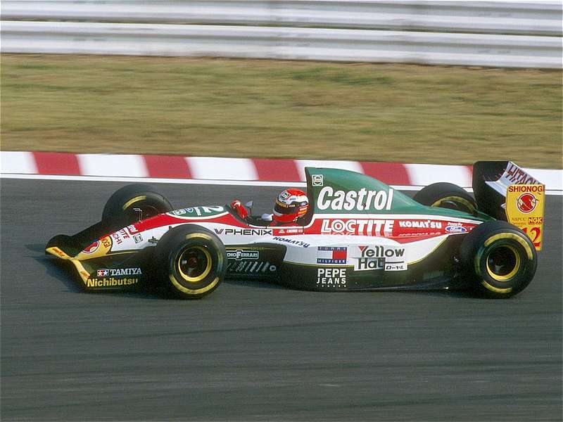
Re: Reject Liveries
Posted: 25 Jan 2010, 16:38
by elho
Shadow DN9 with the lion livery

Arrows FA15


Re: Reject Liveries
Posted: 25 Jan 2010, 16:39
by Popi_Larrauri
Frentzen127 wrote:Minardi had in its books both the best and the worst as far as liveries are concerned.
The 1996/7 years were pretty poor in the looks department, but i think the 97 challenger takes the cake. White, Yellow and Black are Minardi's colours, but you need to know how to put them together. Mild Seven's blue made it all the more messy.
I must jump in defense of this colour scheme. I loved it and found it the best alongside with Sauber's in 1997.
Re: Reject Liveries
Posted: 25 Jan 2010, 16:43
by noisebox
kostas22 wrote:Lotus 107B
I quite like that one - I think it maybe because I made the Tamiya model of it!
Re: Reject Liveries
Posted: 25 Jan 2010, 16:56
by ADx_Wales
thru personal opinon, never liked this one much. Possibly a kneejerk reaction from the loss of all the Benetton green.
Re: Reject Liveries
Posted: 25 Jan 2010, 16:59
by Pieman
kostas22 wrote:Lotus 107B
That's the one I meant above - different scraps of colour and logos floating all over the place with no proper design.
And I thought the MasterCard Lola livery was quite nice - not as attractive as the Shannon Forti though.
Re: Reject Liveries
Posted: 25 Jan 2010, 17:07
by Bleu
Martin Brundle's special livery in 1993 Japanese and Australian GPs.

Re: Reject Liveries
Posted: 25 Jan 2010, 18:03
by LucaPacchiarini
elho wrote:
this livery pretty sums up everything that was wrong with the 90's
Re: Reject Liveries
Posted: 25 Jan 2010, 18:11
by LucaPacchiarini
Bleu wrote:Martin Brundle's special livery in 1993 Japanese and Australian GPs.
You may not know this, but this livery was designed by Hugo Pratt, a famous italian artist, recently deceased.
He was the author of various comic books and illustrations. Mostly known for the adventure comic "Corto Maltese".
A little unuseful trivia I know, but I like him so much

Re: Reject Liveries
Posted: 25 Jan 2010, 19:27
by RaceFace
Wow, I did miss the gitane artist´s "special-livery" back in 93. Thanks for updating me

To me, it is honestly ugly....makes me think of a blue-white cow...

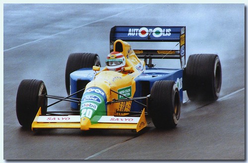
also the 1991 benetton was just dispointingly bland. But I think it just lacked a red touch between yellow-green-blue....The year before in 1990 the benettons looked soooo cool...Actually to me all cars before 1994 looked cool ...

Re: Reject Liveries
Posted: 25 Jan 2010, 19:30
by coops
kostas22 wrote:Lotus 107B
I dont know why, and every criticism of the mass of advertising is justified, but I just
loved that car. It looked fast and, occasionally, it was fast.
Re: Reject Liveries
Posted: 25 Jan 2010, 19:31
by Collieafc
elho wrote:Arrows FA15
I quite liked that livery. Granted, its very early 90s style, but I still love it
But quite a lot of liveries nowadays are a bit plain. Brawn was a prime example (although seeing as they hadnt had time to find sponsors, thats semi-forgivable). But a lot of them seem to use white excessively now. Brawn, Toyota, Williams, BMW, Renault (who should go back to the 2005-06 style scheme IMO), Force india to a lesser extent.
Re: Reject Liveries
Posted: 25 Jan 2010, 19:35
by RaceFace
Why did nobody like the brawn outfit ?

I loved the plain white paired with the bold black stripes and the fluo-yellow.
Looked very clean to me. Also I loved the 1990´s Onyx´s, though they sported pink...
Re: Reject Liveries
Posted: 25 Jan 2010, 19:41
by MaxZero
The grid probably looked its best at the start of 2002. Green Jaguars, Yellow Jordans, mostly Blue Renaults and Saubers, Orange Arrows, and red, white and darker shades dotted here and there on the rest. A very nice balance