
All right, here are the results! It was difficult to make decisions, as the better looking ones did not meet the set requirements as good as the lesser looking ones. I tried to find a balance in that for the rankings.
4 - Normal32
Wings for Life would be a great title sponsor for Toro Rosso and I'm sure it is suitable for a nice livery. Also, the colour scheme makes this entry easy to distinguish from Red Bull Racing. The logo could be more of an eye-catcher if you would make it white on the black background. The red accents are a good idea, but they could be used more effectively.
3 - peteroli34
A very nice looking livery. This colour scheme deserves a place on the grid and i like the placements of the Red Bull logos, different but just as effective as the original. However, I miss a reason for this colour scheme. With so many Red Bull related brands, you could choose almost any kind of colours and find a (sub)brand to go with it. That would have made it a probably more realistic livery for Toro Rosso.
2 - Biscione
This one is just as the challenge was meant to be. Use a Red Bull related brand, make it main sponsor and use its colour scheme. The rectangle theme is very well used too. But my word, beige and pink on an F1 car? Let's hope that never happens. Also, the Cepsa red clashes with the pink a lot and the Red Bull logos and the red bull are less visible on that background. Maybe switching the beige and pink would make this livery work better.
1 - AxelP800
Just as peteroli34's entry, this lacks a proper brand. However, the black and yellow would satisfy Renault, which is a plausible reason for this colour scheme. I really like how this livery looks and all the sponsor logos look good on it. I would probably have left the front of the sidepods black, though, but that really is all I can criticise this livery for. So, congratulations!
The GP Rejects Livery Designing Competition
Re: The GP Rejects Livery Designing Competition
YOUR
LOGO
Here
LOGO
Here
Re: The GP Rejects Livery Designing Competition
Whoa, I actually win 
Next challenge, brace.....
Micronation Challenge
Paint a livery to support, recognized them. Although it seems hard, don't worry here's the source: https://en.wikipedia.org/wiki/List_of_micronations, but use the micronations that still exist or still exist post-year 2000. Don't use this btw: http://mw.micronation.org/wiki/Main_Page, it looks.......no words can describe it.
I will post ratings 2 weeks from now, 17th July 2015, so make sure you finished the entry the day before. Go!
Rio Haryanto for the win!
He upon seeing me accidentaly paint Belgian flag rotated 90 deg to right
tommykl returns from the bathroom
tommykl reads the chat logs
tommykl has a stroke
He upon seeing me accidentaly paint Belgian flag rotated 90 deg to right
tommykl returns from the bathroom
tommykl reads the chat logs
tommykl has a stroke
-
Ataxia
- Not Important
- Posts: 6862
- Joined: 23 Jun 2010, 12:47
- Location: Sneed's Feed & Seed (formerly Chuck's)
- Contact:
Re: The GP Rejects Livery Designing Competition
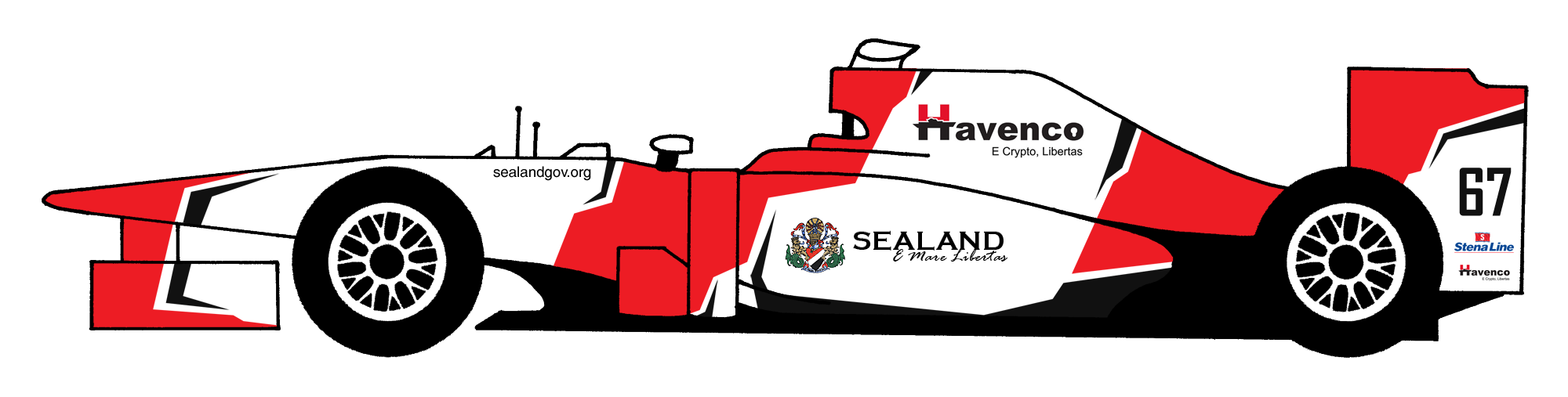
This livery represents The Principality of Sealand. The jagged flashes on the livery take their inspiration from the dazzle camouflage that ships used during times of war in the past, and have been replicated in the colours of the Sealand flag. The number 67 denotes the year in which the Principality of Sealand was born.
Mitch Hedberg wrote:I want to be a race car passenger: just a guy who bugs the driver. Say man, can I turn on the radio? You should slow down. Why do we gotta keep going in circles? Man, you really like Tide...
-
AdrianBelmonte_

- Posts: 804
- Joined: 30 Nov 2014, 12:53
- Location: Moderdonia (google it)
- Contact:


Re: The GP Rejects Livery Designing Competition
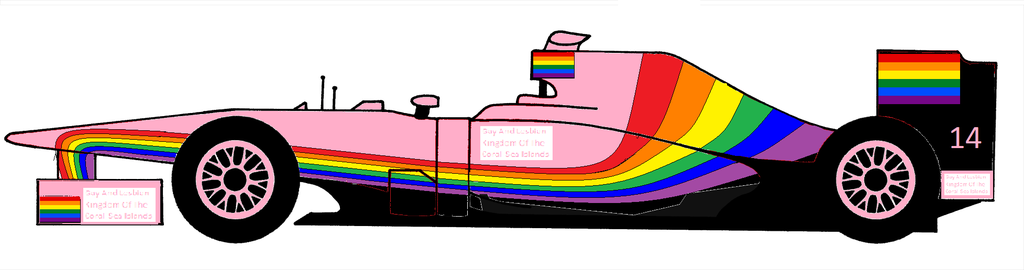
Coral Sea Islands (full name Gay and Lesbian Kingdom of the Coral Sea Islands) . Again, not much effort done, but perfectly in spirit of the country. Could have done a better job with the country name placement, but too late for that. The country does (unsurprisingly) not seem to have an official coat of arms.

I don't know what i want and i want it now!
Re: The GP Rejects Livery Designing Competition
Tomorrow is the judgement day (uwot) when I will post the ranks, and I will do it afternoon my local time, so let's use the chance today!
Rio Haryanto for the win!
He upon seeing me accidentaly paint Belgian flag rotated 90 deg to right
tommykl returns from the bathroom
tommykl reads the chat logs
tommykl has a stroke
He upon seeing me accidentaly paint Belgian flag rotated 90 deg to right
tommykl returns from the bathroom
tommykl reads the chat logs
tommykl has a stroke
Re: The GP Rejects Livery Designing Competition
Okay three entries, that's better than none at all.
3. This - Coral Sea Islands
Light pink combined with LGBT flag. Nope. It just doesn't really suit each other. White would be better base colour.
2. AdrianBelmonte_ - Molossia
Actually these two between AdrianBelmonte and Ataxia are quite hard, because both looks very good with it's own charm. But sadly this kind of competition does not allow co-winners. Some nice "ripples" on the back of the car there, what's bringing this down is the Visa sponsor. You could re-coloured it to match the livery.
1. Ataxia - Principality of Sealand
Nice simple colouring and those black extra lines fits greatly with the livery outline. Your turn!
Rio Haryanto for the win!
He upon seeing me accidentaly paint Belgian flag rotated 90 deg to right
tommykl returns from the bathroom
tommykl reads the chat logs
tommykl has a stroke
He upon seeing me accidentaly paint Belgian flag rotated 90 deg to right
tommykl returns from the bathroom
tommykl reads the chat logs
tommykl has a stroke
Re: The GP Rejects Livery Designing Competition
I actually thought of white originally, but that didn't work, so it became pink. Can't argue about taste, of course.
It shouldn't win anyway, considering the lack of effort i put in it.
It shouldn't win anyway, considering the lack of effort i put in it.
I don't know what i want and i want it now!
-
Ataxia
- Not Important
- Posts: 6862
- Joined: 23 Jun 2010, 12:47
- Location: Sneed's Feed & Seed (formerly Chuck's)
- Contact:
Re: The GP Rejects Livery Designing Competition
Oh cool, I won! Okay, here's my challenge for you guys:
Smoke The Competition
With articles of late that suggest F1 should look back into the past to help develop more rebellious icons in the sport today, this challenge looks at one of the bigger influences in the competition back then; tobacco sponsorship.
You must come up with a livery that predominantly uses a cigarette/tobacco brand's colour scheme. This brand name must not have appeared as a title sponsor of a Formula One team in the past; that is, the name of the brand cannot have appeared in the team's name on the entry list of any season (eg. Benson & Hedges Jordan Honda, or West McLaren Mercedes...you get the idea). You may also use e-cig brands.
The winner will be the car I judge to have the most cohesive and attractive livery. You may add extra sponsors, but these should be made to fit with the main livery scheme.
Deadline is Tuesday 4th August, 12:00 BST.
Mitch Hedberg wrote:I want to be a race car passenger: just a guy who bugs the driver. Say man, can I turn on the radio? You should slow down. Why do we gotta keep going in circles? Man, you really like Tide...
-
novitopoli
- Site Donor

- Posts: 987
- Joined: 25 Aug 2014, 16:56
Re: The GP Rejects Livery Designing Competition
Ataxia wrote:Oh cool, I won! Okay, here's my challenge for you guys:
Smoke The Competition
With articles of late that suggest F1 should look back into the past to help develop more rebellious icons in the sport today, this challenge looks at one of the bigger influences in the competition back then; tobacco sponsorship.
You must come up with a livery that predominantly uses a cigarette/tobacco brand's colour scheme. This brand name must not have appeared as a title sponsor of a Formula One team in the past; that is, the name of the brand cannot have appeared in the team's name on the entry list of any season (eg. Benson & Hedges Jordan Honda, or West McLaren Mercedes...you get the idea). You may also use e-cig brands.
The winner will be the car I judge to have the most cohesive and attractive livery. You may add extra sponsors, but these should be made to fit with the main livery scheme.
Deadline is Tuesday 4th August, 12:00 BST.
It's probably down to me but I can't think of any (at least major) tobacco brands who never sponsored a Formula 1 team...yet it's an interesting challenge and I might take a shot at it, if I have some spare time...
sw3ishida wrote:Jolyon Palmer brought us closer as a couple, for which I am grateful.
Ataxia wrote:Londoner wrote:Something I've thought about - what happens to our canon should we have a worldwide recession or some other outside event?
We'll be fine. It's Canon, non Kodak.
-
DemocalypseNow

- Posts: 13185
- Joined: 17 Aug 2009, 09:30
- Location: Lost, send help
- Contact:
Re: The GP Rejects Livery Designing Competition
Silk Cut Jaguar

Reimagining a classic. Updated for the 21st Century, this livery harks back to the days of the legendary TWR-run Jaguar sportscar programme.
Reimagining a classic. Updated for the 21st Century, this livery harks back to the days of the legendary TWR-run Jaguar sportscar programme.
Novitopoli wrote:Everytime someone orders at Pizza Hut, an Italian dies.
Novitopoli wrote:Juve's Triplete: Calciopoli, doping & Mafia connections.


Re: The GP Rejects Livery Designing Competition
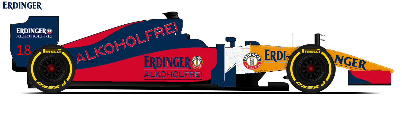
Vype BAR Honda
British American Racing returns! To promote their new e-cigarette brand Vype, BAT re-enters Formula 1 racing. Just as before, they will use Honda engines. Sonax and Bridgestone return as sponsors. Budweiser and Texaco provide nice big red logos on the car and Roces, Men's Health and JVC give it some hints to reject teams as a tribute to this site.
British American Racing returns! To promote their new e-cigarette brand Vype, BAT re-enters Formula 1 racing. Just as before, they will use Honda engines. Sonax and Bridgestone return as sponsors. Budweiser and Texaco provide nice big red logos on the car and Roces, Men's Health and JVC give it some hints to reject teams as a tribute to this site.
YOUR
LOGO
Here
LOGO
Here

Re: The GP Rejects Livery Designing Competition
For some reason GP2 on my DOSBox now crashes unless I put it to spectator only (no driver selected) with an "Divide by zero" error upon entering circuit.  Also, I've testing a new image host.
Anyway, here we go: Gudang Garam (an Indonesian brand of cigarettes... specifically the International one)


Yeah, this is a quick job that took me few minutes to create and upload it to GP2.
Anyway, here we go: Gudang Garam (an Indonesian brand of cigarettes... specifically the International one)
Yeah, this is a quick job that took me few minutes to create and upload it to GP2.
PSN ID: FMecha_EXE | FMecha on GT Sport
Re: The GP Rejects Livery Designing Competition
Agh! I got late to design my livery! Gudang Garam is also my idea  But anyway I'll let ypu have it, it looks decent
Rio Haryanto for the win!
He upon seeing me accidentaly paint Belgian flag rotated 90 deg to right
tommykl returns from the bathroom
tommykl reads the chat logs
tommykl has a stroke
He upon seeing me accidentaly paint Belgian flag rotated 90 deg to right
tommykl returns from the bathroom
tommykl reads the chat logs
tommykl has a stroke
-
Peteroli34

- Posts: 1957
- Joined: 25 May 2013, 10:01
- Location: Thurrock, Which isn't London
-
Ataxia
- Not Important
- Posts: 6862
- Joined: 23 Jun 2010, 12:47
- Location: Sneed's Feed & Seed (formerly Chuck's)
- Contact:
Re: The GP Rejects Livery Designing Competition
You got about a week left...keep the mobile fag-packets coming.
Mitch Hedberg wrote:I want to be a race car passenger: just a guy who bugs the driver. Say man, can I turn on the radio? You should slow down. Why do we gotta keep going in circles? Man, you really like Tide...
Re: The GP Rejects Livery Designing Competition
My entry using BAT's local brand North State and the only other sponsor I could think that fits the colour scheme.
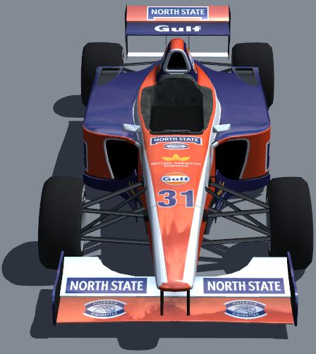
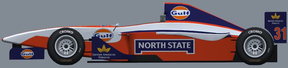
I know the logos are a bit stretched, but that's LFS's fault...
I know the logos are a bit stretched, but that's LFS's fault...
Eurosport broadcast for the 1990 Mexican GP prequalifying:
"The Life, it looked very lifeless yet again... in fact Bruno did one, slow lap"
"The Life, it looked very lifeless yet again... in fact Bruno did one, slow lap"
-
Ataxia
- Not Important
- Posts: 6862
- Joined: 23 Jun 2010, 12:47
- Location: Sneed's Feed & Seed (formerly Chuck's)
- Contact:
Re: The GP Rejects Livery Designing Competition
RESULTS
5th. FMecha - Gudang Garam
It's a red car with a yellow stripe. Nothing else to say, really.
4th. tBone - Vype
I thought the livery itself was a nice take on a black and white scheme. However, I asked for the brand to be prominent; I feel the Vype logos are too sparse and the Honda logos too large. Is it a Vype car or a Honda car?
3rd. Biscione - Silk Cut
The top three were really close for this one. I really liked the idea of a Silk Cut livery, and the lines are very clean. However, I feel that there's too much purple; because you mentioned the TWR livery, I feel compelled to compare the two. I prefer purple in this instance to be used more sparingly.
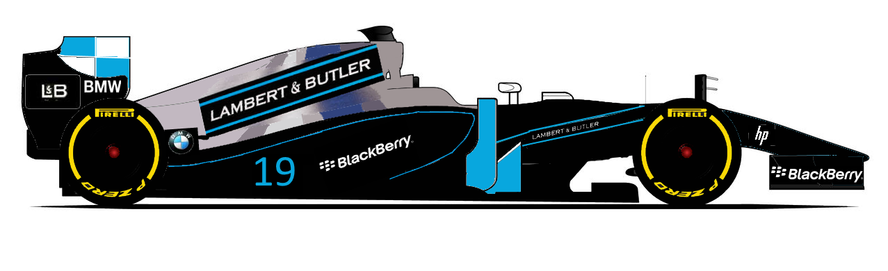
2nd. peteroli34 - Lambert & Butler
I thought this one was pretty cool; the black/silver/light blue lends itself well to a racing livery. My only real issue with this one is sticker placement; the logos on the rear wing endplate are a touch too close, for example.
1st. Nuppiz - North State
First off, I'm a sucker for orange. Secondly, I like the choice of a left-field brand and the car fits the design of the pack well. Nice, clean design. Your turn.
5th. FMecha - Gudang Garam
It's a red car with a yellow stripe. Nothing else to say, really.
4th. tBone - Vype
I thought the livery itself was a nice take on a black and white scheme. However, I asked for the brand to be prominent; I feel the Vype logos are too sparse and the Honda logos too large. Is it a Vype car or a Honda car?
3rd. Biscione - Silk Cut
The top three were really close for this one. I really liked the idea of a Silk Cut livery, and the lines are very clean. However, I feel that there's too much purple; because you mentioned the TWR livery, I feel compelled to compare the two. I prefer purple in this instance to be used more sparingly.
2nd. peteroli34 - Lambert & Butler
I thought this one was pretty cool; the black/silver/light blue lends itself well to a racing livery. My only real issue with this one is sticker placement; the logos on the rear wing endplate are a touch too close, for example.
1st. Nuppiz - North State
First off, I'm a sucker for orange. Secondly, I like the choice of a left-field brand and the car fits the design of the pack well. Nice, clean design. Your turn.
Mitch Hedberg wrote:I want to be a race car passenger: just a guy who bugs the driver. Say man, can I turn on the radio? You should slow down. Why do we gotta keep going in circles? Man, you really like Tide...
Re: The GP Rejects Livery Designing Competition
Considering the amount of effort I put into that, I'm slightly surprised that I won... on a closer look there's a few things I'd change but whatever, here's the next challenge.
With increasing criticism from the EU and the sport visiting countries that frown upon or have banned alcohol consumption entirely, F1 teams are in a difficult position concerning alcohol sponsorship. One hypothetical alternative would be to replace them with non-alcoholic variants of the same brands.
So your task is to design a livery where the main sponsor is a drink that is supposed to emulate the taste and feel of an alcoholic drink without the actual alcohol. It can be a non-alcoholic beer, non-alcoholic cider or whatever, and it can either be a brand that exclusively concentrates on non-alcoholic drinks or a non-alcoholic variant of a regular brand. If you use the latter option, please make it extra-prominent that you're only advertising the non-alcoholic variant. Think of the 1995 Benetton for example, which occasionally featured Bitburger Drive Alkoholfrei in place of regular Bitburger.
Deadline is on 16th August 12:00 UTC.
Eurosport broadcast for the 1990 Mexican GP prequalifying:
"The Life, it looked very lifeless yet again... in fact Bruno did one, slow lap"
"The Life, it looked very lifeless yet again... in fact Bruno did one, slow lap"
-
DemocalypseNow
- Posts: 13185
- Joined: 17 Aug 2009, 09:30
- Location: Lost, send help
- Contact:
Re: The GP Rejects Livery Designing Competition
Sapporo Honda

Promoting one of Japan's best selling alcohol-free beverages, this customer Honda team takes extensive backing from the brewery, along with support backing from watchmaker Seiko. Honda protege Nobuharu Matsushita is in the hotseat.
Promoting one of Japan's best selling alcohol-free beverages, this customer Honda team takes extensive backing from the brewery, along with support backing from watchmaker Seiko. Honda protege Nobuharu Matsushita is in the hotseat.
Novitopoli wrote:Everytime someone orders at Pizza Hut, an Italian dies.
Novitopoli wrote:Juve's Triplete: Calciopoli, doping & Mafia connections.
-
Ataxia
- Not Important
- Posts: 6862
- Joined: 23 Jun 2010, 12:47
- Location: Sneed's Feed & Seed (formerly Chuck's)
- Contact:
Re: The GP Rejects Livery Designing Competition
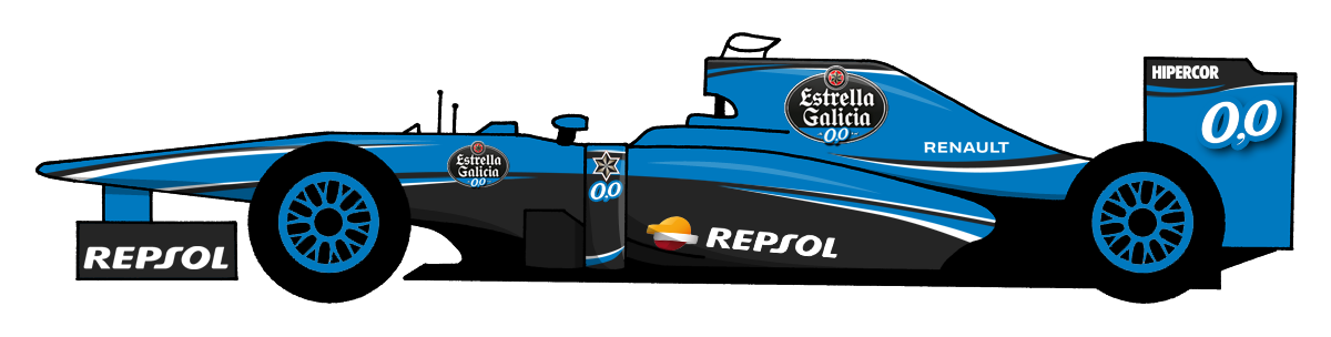
Here's the Estrella Galicia 0,0% design, which will probably appear (with some tweaks) in some of the ASMF series.
Mitch Hedberg wrote:I want to be a race car passenger: just a guy who bugs the driver. Say man, can I turn on the radio? You should slow down. Why do we gotta keep going in circles? Man, you really like Tide...
-
Peteroli34
- Posts: 1957
- Joined: 25 May 2013, 10:01
- Location: Thurrock, Which isn't London
Re: The GP Rejects Livery Designing Competition
My attempt the bit at the front is supposed to be a recreation of the drink in a glass but i couldn't quite pull of the effect
Re: The GP Rejects Livery Designing Competition
You've still got one and a half days left... though I won't mind if there's no more entries than this as it'll mean less work for me. 
Eurosport broadcast for the 1990 Mexican GP prequalifying:
"The Life, it looked very lifeless yet again... in fact Bruno did one, slow lap"
"The Life, it looked very lifeless yet again... in fact Bruno did one, slow lap"
Re: The GP Rejects Livery Designing Competition
Well then, I was hoping for more entries...
3. Peteroli34
The colour scheme is somewhat nice, looking like a mixture of a early 1990s Larrousse, MasterCard Lola and Orange Arrows and having good contrast. However, the design is brought down by the complete lack of associate sponsors and poor finish (I can see white edges around some of the logos). I also don't think splitting the logo in two on the nose is a very good idea.
2. Biscione
If peteroli's entry lacked associate sponsors and finish, this has both of them. The design emulates the features seen on the bottle pretty well while still fitting the car's shape. Unfortunately the combination of orange and golden yellow lacks contrast, and the Honda logos on both wings simply don't stand out enough.
1. Ataxia
In the end the winner is an entry that ticks all the boxes. The combination of black, blue and a touch of white gives it contrast and the way how the stripes are laid out makes the car look like it's moving even while stationary. Although the design is a clear nod to their Moto3 livery, it's still the best one out of this crop.
I see a pattern emerging here...
Eurosport broadcast for the 1990 Mexican GP prequalifying:
"The Life, it looked very lifeless yet again... in fact Bruno did one, slow lap"
"The Life, it looked very lifeless yet again... in fact Bruno did one, slow lap"
-
Ataxia
- Not Important
- Posts: 6862
- Joined: 23 Jun 2010, 12:47
- Location: Sneed's Feed & Seed (formerly Chuck's)
- Contact:
Re: The GP Rejects Livery Designing Competition
Supermarket Sweep
Let's go back to basics and do something readily accessible. Pick a supermarket. Base a livery around its colour scheme. The winner will be the one I judge to be the most professional livery. Make it sexy.
Oh, just a couple of things.
- You can only use two colours (barring sponsor logos) for the livery itself.
- Associate sponsors must be products available in the store you have selected.
Best of luck!
Mitch Hedberg wrote:I want to be a race car passenger: just a guy who bugs the driver. Say man, can I turn on the radio? You should slow down. Why do we gotta keep going in circles? Man, you really like Tide...
Re: The GP Rejects Livery Designing Competition
Jumbo Supermarkten
Jumbo is owned by Frits van Eerd, who has a very nice collection of Minardi's. That is of course the reason I couldn't possibly choose another supermarket!
The livery is (Minardi!) yellow and white, which are Jumbo's corporate colours. Obviously, plenty of Jumbo logos are featured, including some "Hallo Jumbo" ones, which is Jumbo's slogan. The logos with 7 in them, are the symbol of Jumbo's "7 certainties", another slogan. Secondary sponsors are Spa (mineral water), Old Amsterdam (cheese), Benson & Hedges (tobacco), Mentos (mints), Hertog Jan (great beer), Duracell (batteries), BIC (pens/lighters), Fanta (soft drinks), Chiquita (bananas), Remia (sauces) and Jumbo's store brand. I guess you can say I pretty much covered the entire supermarket.
YOUR
LOGO
Here
LOGO
Here
Re: The GP Rejects Livery Designing Competition
Why not.
Pasta_maldonado wrote:I think normal32 is an old English farmer re-incarnated
-
Ataxia
- Not Important
- Posts: 6862
- Joined: 23 Jun 2010, 12:47
- Location: Sneed's Feed & Seed (formerly Chuck's)
- Contact:
Re: The GP Rejects Livery Designing Competition
I'm gonna give this until Wednesday. Bit disappointed with the turnout so far, considering it's a pretty simple challenge.
Mitch Hedberg wrote:I want to be a race car passenger: just a guy who bugs the driver. Say man, can I turn on the radio? You should slow down. Why do we gotta keep going in circles? Man, you really like Tide...
-
Ataxia
- Not Important
- Posts: 6862
- Joined: 23 Jun 2010, 12:47
- Location: Sneed's Feed & Seed (formerly Chuck's)
- Contact:
Re: The GP Rejects Livery Designing Competition
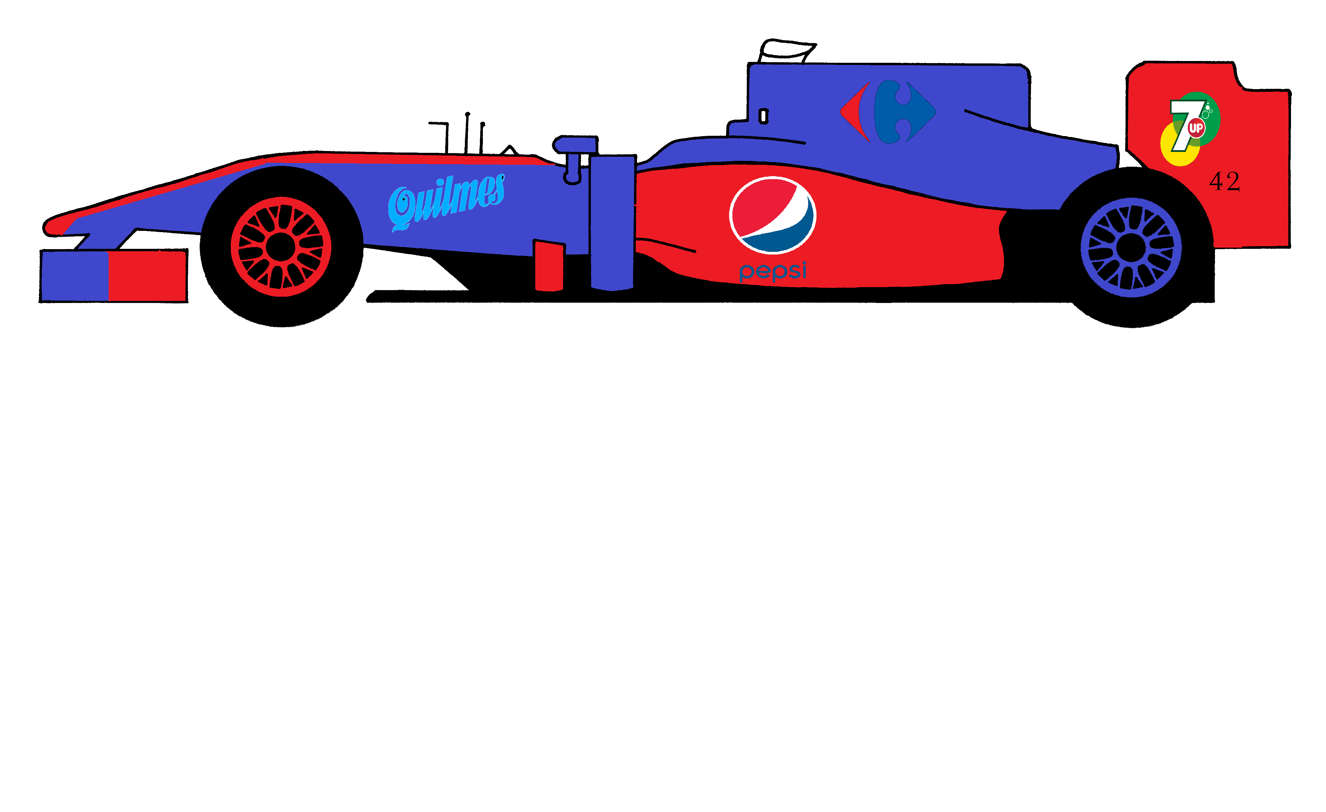
...and that's it. Two entries.
tBone wins by default, since I can barely make out the Carrefour logo on Normal's entry.
tBone wins by default, since I can barely make out the Carrefour logo on Normal's entry.
Mitch Hedberg wrote:I want to be a race car passenger: just a guy who bugs the driver. Say man, can I turn on the radio? You should slow down. Why do we gotta keep going in circles? Man, you really like Tide...
Re: The GP Rejects Livery Designing Competition
It was a shame that there were so few entries last time. I've tried to make a challenge for which it's easy to create an entry.
Commercial Cleanup
What if sponsorships never existed? Would cars be painted in one, bland colour? Or would teams make other efforts somehow, like BMW's art cars?
The objective of this challenge is to create a livery without any sponsor logos. That means no text or (existing or made-up) logos on the car, apart from maximum 3 racing numbers (one on each side and one on the nosecone). Make it an interesting, good-looking livery by being creative. Go-faster stripes, finish flags, bubbles, colour gradients, retro, futuristic, sophisticated, eye-catching, go crazy!
The winner will simply be the livery that suits the car best and looks like it doesn't need sponsors. I'll judge the entries in the weekend of 19-20 September.
YOUR
LOGO
Here
LOGO
Here
Re: The GP Rejects Livery Designing Competition
You've got a couple of days left! Let's get those entries coming in guys!
YOUR
LOGO
Here
LOGO
Here
Re: The GP Rejects Livery Designing Competition
tBone wrote:You've got a couple of days left! Let's get those entries coming in guys!
I'm afraid people are a bit too preoccupied with showcasing their talent on liveries that are going to be used in the ongoing PMMF season. Perhaps this competition should be put on hold and restarted once PMMF is in off-season?
Eurosport broadcast for the 1990 Mexican GP prequalifying:
"The Life, it looked very lifeless yet again... in fact Bruno did one, slow lap"
"The Life, it looked very lifeless yet again... in fact Bruno did one, slow lap"
Re: The GP Rejects Livery Designing Competition
Nuppiz wrote:tBone wrote:You've got a couple of days left! Let's get those entries coming in guys!
I'm afraid people are a bit too preoccupied with showcasing their talent on liveries that are going to be used in the ongoing PMMF season. Perhaps this competition should be put on hold and restarted once PMMF is in off-season?
You could be right there. I really should join in the PMMF activities, shouldn't I? I'm totally unaware of what's happening there at the moment
YOUR
LOGO
Here
LOGO
Here